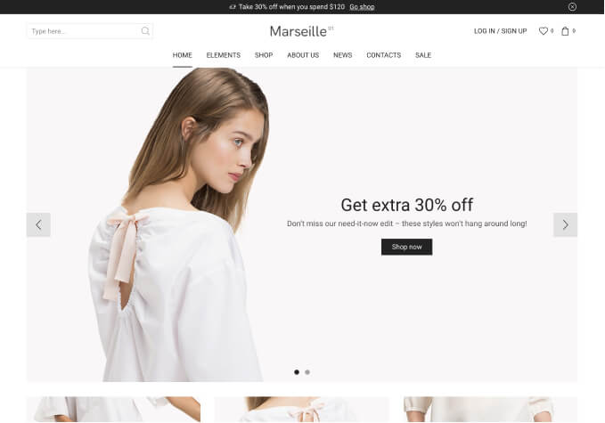
Regarding the issue that after modifying images and text, the initial template effect cannot be achi

This topic has 23 replies, 2 voices, and was last updated 3 months, 1 weeks ago ago by Luca Rossi

  • Avatar: bzzxzz
    bzzxzz
    Participant
    July 17, 2024 at 18:10

    The main issue is that I’ve only made changes to the text and images based on the template.
    And the size of the images is also set according to the size specified in the template.
    The overall effect is roughly the same,
    but it’s always impossible to avoid problems such as images being obscured or experiencing effects similar to “breaking the scene” when resizing the window.
    I’ve tried adjusting various settings, but these issues persist when the window is resized.

    I compared it with the original template, and it does not exhibit the problems I encounter when the window size changes.
    I don’t know where the problem lies, and how to correct or avoid it?

    问题主要集中在,我只是在模版的基础上,修改了文字和图片。
    并且图片的大小也是按照模版中图片的大小来设置的,
    出来的效果大体一样,
    但始终避免不了,在调整窗口大小的时候,图片总是会被遮挡,或者出现类似穿帮的效果。
    我努力的调整各种设置,但是在窗口变化的时候,这些问题已经存在。

    我对比了原来是我模版,在变动窗口大小的时候,并不会出现我出现的那些问题。
    我不知道问题出在哪里?并且怎么修正或者避免?

    Files is visible for topic creator and
    support staff only.
    22 Answers
    Avatar: bzzxzz
    bzzxzz
    Participant
    July 17, 2024 at 18:17

    Addition.

    Files is visible for topic creator and
    support staff only.
    Avatar: Justin
    Luca Rossi
    Support staff
    July 19, 2024 at 04:57

    Hi @bzzxzz,

    The solution is set the max width for the description text. Please try adding the following custom CSS codes under XStore > Theme Options > Theme Custom CSS > Global CSS:

    
    .etheme-flipbox-side_a .etheme-flipbox-description.etheme-flipbox-description-a {
        max-width: 70%;
    }
    

    Hope it helps!

    Files is visible for topic creator and
    support staff only.
    Avatar: bzzxzz
    bzzxzz
    Participant
    July 19, 2024 at 09:04

    Certainly, here’s the translation for your statement:

    “Okay, thank you.
    But I also want to know about the issue with background changes.
    The normal background should be white,
    but when resizing the window,
    the edge of the background will show a gray change.
    I don’t know how to handle this.”

    Files is visible for topic creator and
    support staff only.
    Avatar: Justin
    Luca Rossi
    Support staff
    July 19, 2024 at 11:21

    Dear @bzzxzz,

    We hope this message finds you well. We have noticed that your images, as seen in the following link: https://buddhacrafted.com/wp-content/uploads/2024/05/dfbgn.jpg, display a grey color on the left side.

    To enhance the visual quality of your images, we recommend using PNG files with a transparent background. This adjustment should provide a cleaner and more professional appearance.

    Thank you for your attention to this matter.

    Best Regards,
    8Theme’s Team

    Avatar: bzzxzz
    bzzxzz
    Participant
    August 2, 2024 at 10:30

    Regarding the theme, when resizing the window, gray edges appear on the left and right sides of the theme. Based on your previous email response, I temporarily understand that this is caused by the gray background image.

    However, even on text pages (without any images), gray edges still appear when dragging the window (I’m not sure if my understanding is correct).

    I have tried to set up according to the original template as much as possible, but these gray edges severely affect the overall effect.

    I have tried pasting the following code through the path you provided:

    .etheme-flipbox-side_a .etheme-flipbox-description.etheme-flipbox-description-a {
    max-width: 70%;
    }
    But it didn’t work.

    It seems that all pages of the entire website have this issue.

    I strongly hope that you can help me find the problem. Thank you.

    关于主题,在收缩窗口的时候,主题左右边缘出现灰边的情况。
    我根据你这边回复的邮件,暂时理解为,灰色背景图片导致的。

    但是在文本页面(无任何图片的情况下),拖拉窗口的时候,依旧会出现灰边(不知道我是否理解正确)。

    我尽可能的依照原模版来设置的,但是这灰边太影响整体的效果了。

    我有尝试通过你提供的路径,黏贴了以下代码:

    .etheme-flipbox-side_a .etheme-flipbox-description.etheme-flipbox-description-a {
    max-width: 70%;
    }

    但是并没有效果

    貌似整个网站的所有页面都有这样的问题,
    强烈的希望,你们能够帮助我找到问题,谢谢

    Files is visible for topic creator and
    support staff only.
    Avatar: Justin
    Luca Rossi
    Support staff
    August 3, 2024 at 04:58

    Dear @bzzxzz,

    We hope this message finds you well. We are pleased to inform you that we have updated the template of your homepage to full width. You can view the updated layout at the following link: https://prnt.sc/r2-_2NbIJicU.

    Could you kindly verify if the grey colors previously noted on the edges have been successfully removed?

    Thank you for your attention to this matter.

    Best Regards,
    The 8Theme Team

    Avatar: bzzxzz
    bzzxzz
    Participant
    August 3, 2024 at 07:58

    Hello, thank you for your help, but the results are not as expected.
    A new issue has occurred:
    In Figure 1, the menu bar is being obscured.
    In Figure 2, the dividing lines between the products have disappeared.

    I’m not quite clear on the specific settings or any other operations you’ve made on your end.
    I believe I still need your assistance. (If it could be the same as the template, that would be greatly appreciated!!!)

    Additionally, I would very much appreciate it if I could be taught how to do this myself, thank you.

    你好,谢谢你的帮助,但效果并不好。
    现在出现新的问题了
    图1,菜单栏被遮挡
    图2,产品之间的分割线线消失了

    我这边不太清楚你,你这边设置的具体路径,又或者有其它什么操作。
    我觉得还是需要你的帮助。(我的所求和模版一样就可以了,非常感谢!!!)

    还有,我很希望自己也可以被教会,谢谢。

    Files is visible for topic creator and
    support staff only.
    Avatar: bzzxzz
    bzzxzz
    Participant
    August 3, 2024 at 08:01

    “Image supplement”

    Files is visible for topic creator and
    support staff only.
    Avatar: Justin
    Luca Rossi
    Support staff
    August 5, 2024 at 08:46

    Dear @bzzxzz,

    We hope this message finds you well.

    We are currently reviewing the presentation of your products on our platform and would like to share the following visuals for your reference:

    – Products & Header: [https://prnt.sc/2UXVsOUok-iY](https://prnt.sc/2UXVsOUok-iY)
    – Header: [https://prnt.sc/_oDQ9aw_NMFc](https://prnt.sc/_oDQ9aw_NMFc)

    Could you kindly specify your objectives for the Returns & Refund page? Understanding your goals will help us ensure that the page meets your expectations and requirements.

    Thank you for your attention to this matter.

    Best Regards,
    8Theme’s Team

    Avatar: bzzxzz
    bzzxzz
    Participant
    August 5, 2024 at 09:16

    Hello, I didn’t quite understand what you were trying to convey. Could you please check the emails in chronological order?

    On August 3, 2024, at 08:01 (the issue in the photo)
    is related to the issue left unresolved in your response on August 3, 2024, at 04:58,
    which was initially addressed on August 2, 2024, at 10:30.

    The new issue is severely affecting the overall performance of the website, so I restored it from a backup.

    However, the initial issue regarding the gray border on the edge still has not been resolved.
    This was my primary concern, and the

    I have retained the

    你好,我并没有清楚的明白你想要表达的意思,
    你可以按照,邮件的时间顺序查看一下。

    2024 年 8 月 3 日 08:01(照片中的问题)
    是你们在上述2024 年 8 月 3 日 04:58中,
    处理2024 年 8 月 2 日 10:30问题后遗留的问题

    新问题,严重影响了网站整体的效果,所以我通过备份恢复了。

    但是对于最初提出的,关于边缘灰边的问题,依旧没有能够解决。
    这是我最开始的诉求,文中提到的其他问题,都是在解决关于灰边这个问题中产生的。

    我保留了中文原文内容,希望翻译有准确的表达我的意思,谢谢。

    Files is visible for topic creator and
    support staff only.
    Avatar: Justin
    Luca Rossi
    Support staff
    August 6, 2024 at 08:24

    Hi @bzzxzz,

    In this case, please add this custom CSS under XStore > Theme Options > Theme Custom CSS > Global CSS:

    
    .home .template-content .page-wrapper .container.content-page.sidebar-mobile-bottom,
    .home .prefooter .container, 
    .home .footer .container{
        max-width: 100%;
    }
    

    Here is the home page looks after added the custom CSS: https://www.awesomescreenshot.com/image/49873736?key=81fb39fb6ce18caec7b7108b807da55a.

    Best Regards,
    8Theme’s Team

    Avatar: bzzxzz
    bzzxzz
    Participant
    August 6, 2024 at 11:01

    Hello, thank you for your assistance.

    I’ve looked at the images you sent to me, but I am not trying to change the width of the entire web page. Of course, I tried the code you provided, but it seems to have had no effect. (So I deleted it again.)

    I just want to remove this gray edge, just the gray edge. This gray edge only appears when the window is at a specific size, and all web pages of the site will have a gray edge when the window is at a specific size. I’ve marked it with color.

    I also checked the official template [XStore Elementor Home Decor 02 Demo – WooCommerce Theme](https://xstore.8theme.com/elementor2/home-decor02/), and there is also a problem with the gray edge, but not in the footer area.

    Files is visible for topic creator and
    support staff only.
    Avatar: Justin
    Luca Rossi
    Support staff
    August 7, 2024 at 04:50

    Hi @bzzxzz,

    In this case, can you try adding this custom CSS code isntead?

    
    .page-wrapper {
        background-color: #fff;
    }
    

    Before: https://www.awesomescreenshot.com/image/49895588?key=c79b1b29ef905ead703abe29a6e7ea7b
    After: https://www.awesomescreenshot.com/image/49895596?key=a708b6d217fde4483eb6429aaef46bad

    Let us know how it goes!

    Avatar: bzzxzz
    bzzxzz
    Participant
    August 7, 2024 at 06:08

    Hello, I pasted your code through the path:
    CSS under XStore > Theme Options > Theme Custom CSS > Global CSS
    but it didn’t have any effect. I think I followed the correct steps.

    Also, regarding the image you provided to remove the gray border,
    I’m sorry, but I am not satisfied.
    I only want to remove the gray border, just the gray border.
    I don’t want to change the layout.

    I do not accept solutions that create new issues. Thank you.

    Picture 1
    Image of the code settings

    Picture 2
    Frontend webpage effect after adding the code (cache cleared)

    Picture 3
    The image from your link https://www.awesomescreenshot.com/image/49895596?key=a708b6d217fde4483eb6429aaef46bad
    Marking the change of the overall width

    Picture 4
    Normal, marking the edge width

    Files is visible for topic creator and
    support staff only.
    Avatar: Justin
    Luca Rossi
    Support staff
    August 7, 2024 at 07:42

    Hi @bzzxzz,

    Because your home page is not full width and the body has the grey background color, so the grey edges will appear on some screen sizes.

    If you don’t want to use custom CSS codes to remove the grey edges. Please try with the following steps:

    – Remove all the margins of your sections
    – Switch to the paddings instead
    https://prnt.sc/1_7JnyOuenZ0

    Hope it helps!

    Avatar: bzzxzz
    bzzxzz
    Participant
    August 8, 2024 at 09:06

    It’s not just the homepage where the gray border appears; it occurs on all pages! I want to emphasize that it’s on all pages, including pure text pages (https://buddhacrafted.com/privacy-security/).

    And on pure text pages, the following steps cannot be applied:
    – Remove all the margins of your sections
    – Switch to the paddings instead
    https://prnt.sc/1_7JnyOuenZ0

    Because there is no “Advanced” option in the settings, I question the effectiveness of this method. I tried it, but eventually gave up and continued trying with code.

    I am not opposed to using custom CSS, but after I added it, there was no effect (and I included a link to the image of my actions in my previous email. If there was an error in my operation, please point it out). What I oppose is code that doesn’t work.

    Code from the previous email:

    .page-wrapper {
    background-color: #fff;
    }

    After inserting it, the gray border on the site disappeared, but it remained in the footer. Additionally, the layout of the site changed. I marked it with red lines in the image; please pay attention to the width of the red lines:

    On the shop page, the display width of the products has shrunk.
    The width of the top menu bar has also decreased.
    Perhaps this code can be further optimized, or there might be a better solution. After all, you are the professionals. This is an issue that existed in the original template.

    So, once again, I want to clarify my request! I only want to remove the gray border without changing the website layout and without creating new issues. I just want to remove the gray border.

    Files is visible for topic creator and
    support staff only.
    Avatar: bzzxzz
    bzzxzz
    Participant
    August 8, 2024 at 09:36

    Sorry, I’d like to add something. I noticed that even after I deleted the code:

    .page-wrapper {
    background-color: #fff;
    }
    the width of the top menu bar and the shop page is still not like the official template layout. As far as I remember, I only made changes to the content. I don’t know why this happened. It’s really frustrating, but I still want it to look like the official template.

    Could you tell me what went wrong or what I should do to fix it? Thanks.

    Issue: I marked it with red lines in the image, referencing the official template.

    Files is visible for topic creator and
    support staff only.
    Avatar: Justin
    Luca Rossi
    Support staff
    August 8, 2024 at 10:14

    Hi @bzzxzz,

    For the other pages(NOT home page) and footer, please try this custom CSS:

    
    /* For Page Content */
    .page-template-default .container.content-page {
        max-width: 100%;
    }
    
    /* For Footer */
    footer .container {
        max-width: 100%;
    }
    

    For the home page to remove all the margins and add the paddings, if you don’t see tha Advanced setting, please click on the Layout setting: https://prnt.sc/HR1lRrHagP3A. Do you want us to do it for you?

    For your page, the custom CSS codes provided didn’t change any widths:

    
    .page-wrapper {
    background-color: #fff;
    }
    

    Can we also ask did you change the Site Width & Starting Point of Mobile: https://prnt.sc/vgCrMPQPTbKp? Do you try switching to the default value yet?

    Best Regards,
    8Theme’s Team

    Avatar: bzzxzz
    bzzxzz
    Participant
    August 10, 2024 at 06:18

    Images 1-4: These show the process of implementing the code, and I hope it’s correct. The gray border effect has been removed, but the bottom status bar still remains (is there an issue with my operation? I tried several times, and it worked on the mirror site). Additionally, the gray background at the top has been covered again (see Image 5-1).

    Images 5-6: These compare the initial template import settings with the current settings on my website. The parameters where the red arrow passes are all the same (I want to express that I don’t know where the issue lies).

    Images 7-8: These images show the steps taken to “remove all the margins and add the paddings for the home page.” I’m worried I might not have understood your instructions correctly. If possible, it would be helpful to include the operation path and settings.

    Images 9-10: I switched to the default value, but the menu bar layout changed again. If it can’t be displayed in one row, I would prefer it to be hidden or collapsed.

    Please contact administrator
    for this information.
    Files is visible for topic creator and
    support staff only.
    Avatar: Justin
    Luca Rossi
    Support staff
    August 10, 2024 at 16:49

    Hi @bzzxzz,

    You’ve put the custom CSS codes on the wrong places. All the custom CSS codes should be put under XStore > Theme Options > Theme Custom CSS > Global CSS.

    We’ve logged to your website and corrected all the issues for you.

    Could you please double check again?

    – Home: https://www.awesomescreenshot.com/image/49968988?key=b1a0812f0d86a3ccf6c4780e6ed055aa
    – Return & Refunds: https://www.awesomescreenshot.com/image/49969050?key=bac240b2e23d5c07c72d42ccc2ef8255
    – Privacy & Security: https://www.awesomescreenshot.com/image/49969052?key=afda48984fd92b5eb18b98fab7082325

    If you’re still seeing any issues, please let us know. We’re ready to fix them for you.

    Thank you!

    Avatar: bzzxzz
    bzzxzz
    Participant
    August 11, 2024 at 10:11

    Thank you very much for your help.

    However, there still seem to be some issues.

    Images 1-2:
    On the shop page (https://buddhacrafted.com/shop/), the gray border is still present, although the bottom bar displays correctly.

    Image 3:
    When the homepage loads, a white border also appears.

    Please contact administrator
    for this information.
    Files is visible for topic creator and
    support staff only.
    Avatar: Justin
    Luca Rossi
    Support staff
    August 12, 2024 at 05:04

    Dear @bzzxzz,

    We hope this message finds you well. We are pleased to inform you that the following updates have been made to your shop page:

    1. All previously reported issues on the shop page have been successfully resolved.

    2. We have noticed that the background color of the first section differs from the standard white background. This discrepancy causes grey edges to appear due to the custom CSS codes that are loaded. Should you prefer a uniform appearance, we recommend changing the background color of the first section to white.

    Thank you for your attention to these details. Should you have any further requests or require assistance, please do not hesitate to contact us.

    Best Regards,
    The 8Theme Team

  • Viewing 23 results - 1 through 23 (of 23 total)

You must be logged in to reply to this topic.Log in/Sign up

8theme customization service
We're using our own and third-party cookies to improve your experience and our website. Keep on browsing to accept our cookie policy.