This topic has 2 replies, 2 voices, and was last updated 1 years, 8 months ago ago by Rose Tyler
Hello everyone,
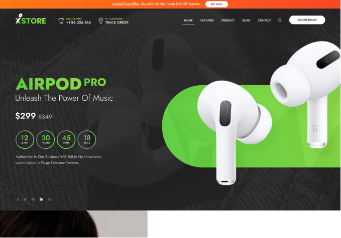
I have a bit of an issue with my website’s Xstore theme. The header works perfectly fine on my desktop computer, and the mobile version is also functioning as intended. However, when I try to access the site on my iPhone by typing the URL into the Safari search bar, I have to manually click on the “mobile version” option in Safari to see the mobile version of my site.
I’m concerned that customers who arrive at my site in “desktop version” mode will not be able to easily navigate the mobile version of my site. Does anyone know how to ensure that customers are directed to the mobile version of my site when accessing it on their mobile devices?
Thank you for any suggestions or advice you can offer
Hello, Mady,
Thank you for contacting us and for using XStore.
Could you please, provide us with more information (screenshots/videos) about the issue you found? It is important to add that you need to check other web-sites from your device because it could be just a “Safari” feature so it could be depended on your browser settings which are not related to the theme you use.
Also, please, ensure that you don’t have any plugins that could create such issue. You may disable all 3d-party plugins that are not come bundled with our theme.
Thank you for your cooperation and we look forward to hearing from you.
Kind Regards,
8theme team
Tagged: assistance, display, mobile, optimization, themes, woocommerce, wordpress
You must be logged in to reply to this topic.Log in/Sign up