This topic has 24 replies, 4 voices, and was last updated 9 years, 9 months ago ago by Robert Hall
I have a few issues with the search form page.
1) I would like to add a return to home page link as well as the included return to shop which is already there. I have this in place but it appears below the ‘ return to shop button, I would like the return to home button to be on the same line? …( please see picture.)
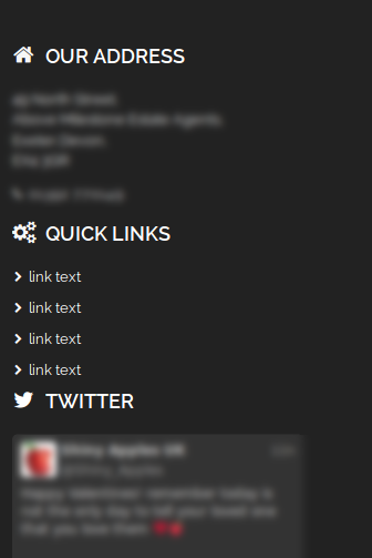
2) On the search form page my footer links, I have added list icons with text that align next to them, on this page the icons are above the text?
Please see image.
Just to add also that the search image does not stay above the text on various widths, mobile devices the search icon goes into the text?
Hello,
1. Please add this code in custom.css file:
.empty-category-block p {
display: inline-block;
margin-right: -120px;
margin-left: 200px;
}
2. Add this code in custom.css:
.uavc-list-content {
display: inline-flex !important;
}
Please show a screenshot concerning search image issue.
Thank you.
Regards,
Eva Kemp.
Hi Eva,
the search image does not stay at the top above the text on lower screen resolutions like shown in the image included.
tablets and iPhone the search image goes into the text.
Hello,
Please try to use this code:
@media (max-width: 480px) { .empty-category-block h2:before {
bottom: 230px;
}
.empty-category-block p {
display: inline-block;
margin-left: 80px;
} }
Regards,
Eva Kemp.
Thanks Eva, I will try that soon.
Still an issue with the list icons not showing as inline in the footer on mobile devices though?
Hello,
As I see the icons are shown inline on mobile.
Could you please show a screenshot?
What mobile device are you checking on?
Thank you.
Regards,
Eva Kemp.
Eva, can you remove the image you posted please as currently the website is in development stage and I don’t want that info on here.
You have not read my issue fully.
The problem occurs on the search page results! you are just looking on the normal page.
The icons do not align like the other pages I.e. home page etc
Still have issues with the search too so this is not resolved.
Forgot to say I am testing on the iPhone in portrait mode, list icons are not inline, return to shop and go to home buttons end up being joined together?
I think I have got somewhere but not fully.
I have added this code which seems to have improved the buttons being seperated.
@media (max-width:320px) {
.empty-category-block p {
display: inline-block;
margin:20px 0px 0px 0px;
}
}
@media (min-device-width:568px) and (max-device-width:767px) {
.empty-category-block p {
display: inline-block;
margin:20px 0px 0px 45px;
}
}
The main problem seems to be the search image staying above the h2 and p text, there are still some media queries where this breaks and the search (magnifying glass) goes into the text?
on the iPhone in portrait on 320px the buttons I would like to align to the left under the h2 text so they are more central, at the moment they are to the right on the screen.
Hello,
Please add this code in custom.css:
@media (max-width: 480px) { .empty-category-block p {
margin-left: 50px !important;
} }
Thank you.
Regards,
Eva Kemp.
Sorry that does not fully solve the problem, now in landscape on the iPhone the search image (magnifying glass) still goes into the text?
Also still the issue with the footer icons??
I really need to get these issues resolved now.
Originally posted;
1) footer list icons not inline on search page using iPhone in portrait mode (unresolved)
2) search page image (magnifying glass) not aligning correctly on mobile (iPhone) in landscape mode
If we could get this resolved please.
Nobody going to answer this then?
Hello,
1) I’ve added some this code into custom.css file. It’s working well now. Please check.
@media (min-width: 480px) and (max-width: 767px){
.empty-category-block h2:before {
bottom: 100%;
}}
2) Maybe provide screenshot for our better understanding and highlight what exactly you want.
Regards,
Robert Hall.
Robert,
Thanks I will check now… FYI I did include plenty of images and described the problem clearly.
Has the footer list icons issue been resolved on the search page as requested?
I’ve checked footer list icons on search page and they showing as inline. Please clean cache and check your site.
Regards,
Robert Hall.
The list icons on the search page are NOT inline which I have repeated several times as my image shows!
On lower resolutions I.e. Mobile such as iPhone in portrait the list icons go above the text?
There seems to be a barrier on communication here?
And the list icons in the footer on mobile (iPhone) in portrait, it’s the same in landscape mode on the mobile too.
The image below is from the home page (Not the search page) using the same iPhone mobile in portrait / landscape mode.
Adding uavc-list-content as display: inline-flex as Eva suggested did NOT work!
Thanks
Hello,
I have fixed footer icons. Could you check your site now?
Regards,
Olga Barlow
Olga,
Thank you! That has done the trick.
What did you do?
Thanks 🙂
Ok I see from the custom.css…. Thank you
You’re welcome!
Regards,
Robert Hall.
The issue related to '‘Search Form Page’' has been successfully resolved, and the topic is now closed for further responses