This topic has 13 replies, 3 voices, and was last updated 10 years ago ago by ianstudio
Hi, would it be possible to make the Side Area and/or the Top Area opened by default ?
THX
Hello,
Could you please clarify the request with more details? Could you please show a screenshot?
Thank you.
Regards,
Eva Kemp.
I’d love to but you have no upload function in this forum or do you and I cannot see it ?!!??
_____________
PLUS MY QUESTION IS DEAD SIMPLE, how can you not understand it ?!??
In Legenda you provide a Hidden Side Area and a Hidden Top Area.. could they be shown as opened by default ? How complicated is my question ;0)
Hello,
Unfortunately we don’t have such options. Sorry.
Regards,
Eva Kemp.
Too bad because the way the little side icon is at the top right sometimes makes it hard for people to comprehend and they don’t click it :0(
Is there any way the script associated to that button could be associated to a menu item manually ? That way I could put a menu element in the main menu that would open the side panel.. And I would be sure people see it in the main menu.
Thanks
Hello,
Sorry, but you need contact web developers concerning your request as a lot of customizations is required.
Regards,
Eva Kemp.
I showed your theme to several clients (one of them is actually using it on their site,.. the others did not like it).. and none of them cared for the top panel and side panel when I demoed the theme to them, as they think most people won’t understand those elements or even see they exist...
And I must accept my clients’ perceptions, personally I like those “gimmicks”.. but over time I realize they cannot be selling points, quite the contrary.. and thus are useless. Maybe you want to talk to your developers about that kind of feedback. Remember that “our clients” (us your customers) are really YOUR customers ultimately (even further down, our clients’ clients are your clients.. they are the ones who need to feel at ease with the UI.)
I’m learning step by step what people do and don’t want, and that dictates what I will buy or not buy anymore. In any case I’ll pretend these options don’t exist because indeed.. too hidden.. and thus dangerous to use.
_____________________________
Is it possible lo to contact someone directly in charge of UI btw ? So I can try and tell them this as I’m sure it can be of interest to them.
THX
Hello,
We took into account your suggestion. Maybe we’ll add such option in one of our next updates, but at present you can implement it only by additional customization if you have appropriate skills.
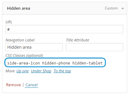
You can also try to use following workaround: add custom link to your menu with side-area-icon hidden-phone hidden-tablet classes.
See 
After that hide icon in top .top-bar .side-area-icon {display: none;} if you don’t need it.
Regards,
Olga Barlow
Ok, almost good except the menu item does not appear in the main menu with the other items but all the way to the side of it.. How can I upload a screen capture on here to show you btw ?!
It’s URGENT so I’m showing it to you live.. I cannot leave it looking messy like this too long.. you can take a look here:
the DESIGNERS title is what I’m talking about, it should be placed next to MEN before the flags.
Dunno if you can help fix this using CSS ?!?
Hello,
Please add this code into custom.css file:
.side-area-icon, .menu-icon {
    right: 315px !important;
    top: -2px !important;
}
.menu-item-language {
   left: 100px !important;
}
Regards,
Eva Kemp.
This quick fix cannot really work, because we are just sort of placing the side-icon as a menu item but its placement is not really specified in relation to the other menu items… which of course are not of the same length (number of letters) in all languages (you can click on the FR flag to see that in action (and in German it’ll be much worse once we have it as there are even more letters..).
Also I had to change your proposal:
right: 315px !important;
to:
left: 465px !important;
otherwise it would be under the flags.
And once clicked it moves away from the other menu item and looks akward.. either hidden under the side area or all the way to the right depending on window pixel size.
Also other issue: even if I remove the:
hidden-phone hidden-tablet
from the CSS classes field, it does not appear in tablet and phone mode in the menu.. and I would need it to also be accessible there as well..
Any idea on how to make this functionality a real menu item and not a sort of menu item that really is the side-icon sort of repurposed ?
Hello,
Try to add following styles in custom.css:
.side-area-icon, .menu-icon {
line-height: 19px;
margin-left: 0;
float: none;
position: static;
}
Regards,
Olga Barlow
It does not work.. why give me “Try this and try that”.. can’t you test it first on one of your test sites? I you can make it work there then tell me how to do it. Your people actually added the css you just gave me without saying anything in my stylesheet, not good.
It does not work anyway, the menu item, once clicked, goes lodge itself underneath the other menu items. So there is a “clicked state that needs to also have some css added to possibly make it work.
The issue related to '‘Side Area and Top Area opened by default’' has been successfully resolved, and the topic is now closed for further responses
