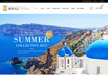
I am having difficulty with this themes responsive design.
The Sidebar cuts off on the iPad in landscape mode as it is wider than the Custom CSS for tablet controls. 768px – 991px
I see no solution for Custom CSS for tablet in Landscape and attempting to modify the Media Screen settings will not function as well.
This CSS turns off the Sidebar for the tablet but only at 768px – 991px.
Many tablets are wider than this in landscape display.
Your help is appreciated.


