Slider issue . Cant view the slider to view in mobile and tablet view. it goes blank when editing

This topic has 9 replies, 3 voices, and was last updated 7 months, 3 weeks ago ago by Luca Rossi

  • Avatar: Zamgra_Legacy
    Zamgra_Legacy
    Participant
    August 7, 2024 at 04:52

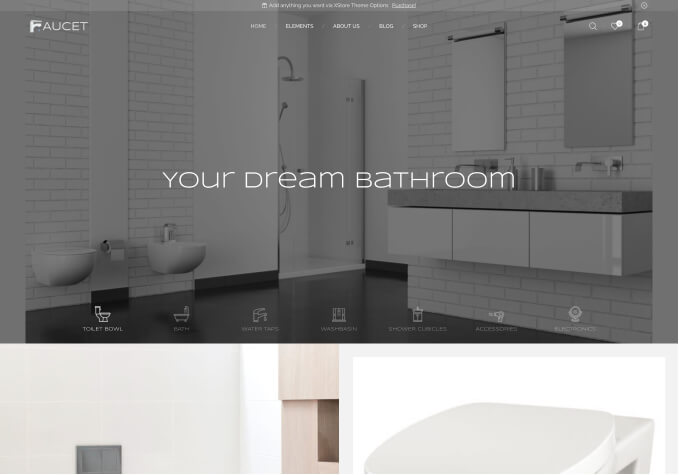
    Slider issue . Cant view the slider to view in mobile and tablet view. it goes blank when editing. The image in mobile view of slider is not fully seen. the banner is works fine with normal desktop mode. when it comes to mobile view the slider image is cut. i need full size same like desktop mode

    Files is visible for topic creator and
    support staff only.
    8 Answers
    Avatar: Tony Rodriguez
    Tony Rodriguez
    Support staff
    August 7, 2024 at 06:03

    Hello, @Zamgra_Legacy,

    Thank you for choosing XStore as your WooCommerce WordPress theme.

    We kindly request that you update your XStore theme to the latest version (9.3.17) and the XStore core plugin to version (5.3.17). These updates are crucial for optimal performance and functionality of your site.

    For details on the enhancements and fixes included in these updates, please refer to our changelog at:
    (https://xstore.8theme.com/update-history/)

    Additionally, we recommend reviewing our theme documentation for guidance on how to implement the updates effectively. You can access the documentation here:
    (https://www.8theme.com/documentation/xstore/theme-installation/theme-update/ )

    Afterward, please check again.

    We trust these resources will assist you in updating your site smoothly.

    Should the issue persist, we kindly request that you record a video demonstrating your actions and the problem. Please upload this video to any file-sharing service and provide us with the link.

    We appreciate your cooperation and look forward to resolving your query promptly.

    Best Regards,
    8Theme’s Team

    Avatar: Zamgra_Legacy
    Zamgra_Legacy
    Participant
    August 7, 2024 at 06:22

    All are Upto date.

    Please contact administrator
    for this information.
    Files is visible for topic creator and
    support staff only.
    Avatar: Justin
    Luca Rossi
    Support staff
    August 8, 2024 at 04:36

    Dear @Zamgra_Legacy,

    We hope this message finds you well. We would like to inform you that the latest version of the XStore theme is now 9.3.17, and the XStore Core plugin has been updated to version 5.3.17.

    To ensure optimal performance and security, we recommend that you update your theme and plugin manually. Please follow the instructions provided in the link below to complete the update:
    [How to Manually Update WordPress Plugin](https://10web.io/blog/how-to-manually-update-wordpress-plugin/)

    Should you require any further assistance, please do not hesitate to contact us.

    Best regards,
    The 8Theme Team

    Avatar: Justin
    Luca Rossi
    Support staff
    August 8, 2024 at 04:39

    Hi @Zamgra_Legacy,

    We could see that your XStore theme & XStore Core plugin have been updated to the lates version.

    And the slider is working fine now:

    – Tablet: https://prnt.sc/M_GVQf_EW1Zx
    – Mobile: https://prnt.sc/6hbZ8DMW6QJr

    Can you confirm?

    Thank you!

    Avatar: Zamgra_Legacy
    Zamgra_Legacy
    Participant
    August 8, 2024 at 07:07

    the banner slider in mobile mode and tablet mode is not full. check that in desktop mode. i need complete image . that mobile mode is cropped in viewing mobile and tablet mode

    Avatar: Justin
    Luca Rossi
    Support staff
    August 8, 2024 at 07:43

    Dear Zamgra_Legacy,

    We hope this message finds you well.

    Could you please confirm if you are referring to the image display in your slider for mobile and tablet views as shown in the following link?

    [https://prnt.sc/84mXKIOdKdwu](https://prnt.sc/84mXKIOdKdwu)

    If this is the case, please note that the height of the images will be considerably reduced, which may impact the visual appeal on these devices. To achieve that, you can try with this custom CSS codes:

    
    @media (max-width: 767px){
        .home .etheme-elementor-slides .swiper-slide-bg {
            background-size: contain !important;
        }
    }
    

    Thank you for your attention to this matter. We look forward to your confirmation.

    Best regards,
    The 8Theme Team

    Avatar: Zamgra_Legacy
    Zamgra_Legacy
    Participant
    August 8, 2024 at 11:13

    But i need that full in portrait mode. the banner seems messy in that horizontal view. can i set a different slider image for phone and tablet mode

    Avatar: Justin
    Luca Rossi
    Support staff
    August 9, 2024 at 04:19

    Dear Zamgra_Legacy,

    We hope this message finds you well. We kindly request your assistance in creating three distinct sliders tailored for different devices: one for desktops, one for tablets, and one for mobiles. Please utilize the Responsive option as detailed in the following link: [https://prnt.sc/24H7ptwnrvW_](https://prnt.sc/24H7ptwnrvW_).

    Please be aware that the loading time for the home page may increase due to the presence of numerous images.

    Thank you for your attention to this matter.

    Best Regards,
    8Theme’s Team

  • Viewing 9 results - 1 through 9 (of 9 total)

You must be logged in to reply to this topic.Log in/Sign up

Helpful Topics

We're using our own and third-party cookies to improve your experience and our website. Keep on browsing to accept our cookie policy.