Hi
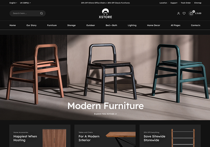
On dark demo – the second slider on homepage; the buttons are not in line with the page – if you look at the first slider the button sits perfectly however the second slider, it does not.
I know how to use revolution slider but didn’t want to change anything in case you have used custom css or something else – see attached image for a view of what I mean –>> https://i.imgur.com/GUr1C7V.png
The two buttons are too far down – they should be like the first slider, essentially above the rs-bullets (the rev slider dots).
Demo page here -> https://xstore.8theme.com/demos/dark/
Second slider within homepage -> /wp-admin/admin.php?page=revslider&view=slide&id=2
My site info is in private – please do not post anything publicly with images etc showing the website as it is not public as yet!
Also, if you turn mobile phone sideways (landscape) the slider is only 50px high. This should be much bigger. Please try turning your mobile sideways on dark theme homepage to see the thin slider. See here – https://ibb.co/CwsN3t3
Thanks for any help.

