Hey there! I feel like I’m dropping by quite a few times lately, but I could really use some more help with the website I’m working on (thank you in advance!)
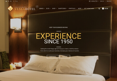
First: With our homepage, we have the basic layout to our liking in desktop mode, with a simple Revolution Slider above a Photo Grid constructed in WPBakery Page Builder. However, the website in Mobile Mode makes the Photo Grid images WAY too large for our liking, and ends up dominating the site. Is there any way we can adjust the image size to make it more appropriate?
Desktop:

Mobile:

Secondly, on the product page, we are seeing the “Product Information” header above the price on the left side of the page:

Is there a way to modify that to say something else, or to remove it? Thank you!


