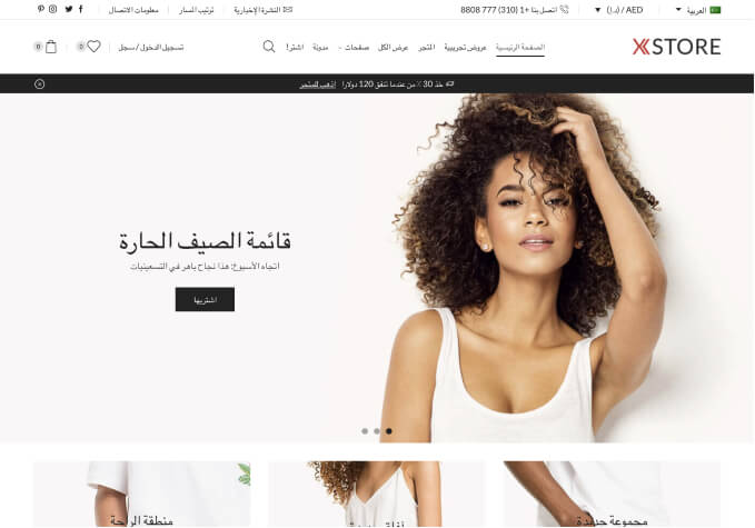
Some of the design has been modified by latest update

This topic has 8 replies, 2 voices, and was last updated 1 years ago ago by Rose Tyler

  • Avatar: AshleyW
    AshleyW
    Participant
    November 5, 2023 at 12:43

    Hi,

    I have just updated Xstore & Elementor this morning and notice that there are some changes to my design styles.

    1. On product pages the ‘add to wishlist’ has moved down to between the ‘buy with GPay’ and Paypal buttons (or if its doesn’t show GPay is is between PayPal ‘take 3’ and the main Paypal buttons). It should’nt be stuck in between payment options, it used to display above all those underneath the ‘Add to Cart’ button.

    2. Checkout Page – Credit/Debit card payment box has changed to white with a black background. Used to be black background with white boxes.

    3. Mailchimp Popup on Homepage – text is greyed out where the background colour and text colour have ‘swapped’. it is now unreadable.

    It looks like something has changed in the style sheet maybe, but I don’t know how to fix it so would appreciate some help. Thanks, Ashley

    7 Answers
    Avatar: Rose Tyler
    Rose Tyler
    Support staff
    November 5, 2023 at 14:02

    Hello, AshleyW,

    Thank you for contacting us and for using XStore.

    1/ Please try to use the next custom CSS code:

    .fixed-content {
        display: flex;
        flex-direction: column;
    }
    .fixed-content .price { order:1; }
    .fixed-content .product_title { order:2; }
    .fixed-content .woocommerce-product-details__short-description { order:3; }
    .fixed-content .variations_form { order:4;}
    .fixed-content .wcpay-payment-request-wrapper { order:6; }
    .fixed-content div#ppcp-messages { order:7; }
    .fixed-content .yith-wcwl-add-to-wishlist { order:5; }
    .fixed-content .ppc-button-wrapper { order:8; }
    .fixed-content .product_meta { order:9; }
    .fixed-content .product-share { order:10; }

    2/ The problem is caused by this custom CSS code:
    https://prnt.sc/ddKQJ5-_Acwp , so you need to delete or change this code added in Theme Options > Theme custom CSS.

    3/ Transparent background comes from https://prnt.sc/fpNmnjfB4xrF , not from our theme.

    We hope this information is helpful.

    Kind Regards,
    8theme team

    Avatar: AshleyW
    AshleyW
    Participant
    November 6, 2023 at 10:07

    Hi,

    Thanks, that has got the ‘add to wishlist’ back in it’s correct place.

    Also, the background for the payment box is now black so that is correct but I couldnt find any option to change the boxes where customers enter their card details themselves to white.

    The mailchimp popup background was always white not transparent. I have searched for the .mc-modal code you sent but cannot find it. Where do I look to change that?

    I have also noticed on the product pages, that the text ‘Two easy pays to pay’ under the Paypal buttons has changed to black and cannot be seen. That text was always and should be white. How do I change that please?

    Thanks, Ashley

    Avatar: Rose Tyler
    Rose Tyler
    Support staff
    November 6, 2023 at 15:37

    Hello, AshleyW,

    “Also, the background for the payment box is now black so that is correct but I couldnt find any option to change the boxes where customers enter their card details themselves to white.” – this content comes from plugins on your site, we can sagest the next custom CSS code:

    .payment_box iframe {
        background: #fff;
    }
    .payment_box .StripeElement iframe {
        background: transparent;
    }

    “The mailchimp popup background was always white not transparent. I have searched for the .mc-modal code you sent but cannot find it. Where do I look to change that?” – added by a 3rd-party plugin, so you need to contact that plugin to get assistance. If you are not sure what exactly plugin you used for this, disable plugins one by one to find the correct one.
    Or use custom CSS code for the background:

    .mc-modal {
        background-color: white !important;
    }

    “I have also noticed on the product pages, that the text ‘Two easy pays to pay’ under the Paypal buttons has changed to black and cannot be seen. That text was always and should be white. How do I change that please?” –
    find out what plugin added that text and contact their support, or use custom CSS code:

    .ppc-button-wrapper {
        background: #f7f7f7;
        border-radius: 3px;
    }

    Kind Regards,
    8theme team

    Avatar: AshleyW
    AshleyW
    Participant
    November 9, 2023 at 10:03

    Hi,

    Sorry I have just seen another design/style change I didn’t notice before. On the checkout page, if you choose ‘Klarna’ as payment method the colours there have also been ‘swapped’. It should be a white background so the writing can be seen. It has changed to black.

    All these above issues were fine before, I don’t understand why colours are changing, surely updates don’t affect the style/design of the site?

    Could you please let me know how to rectify the Klarna box also. Thanks, Ashley

    Avatar: Rose Tyler
    Rose Tyler
    Support staff
    November 9, 2023 at 10:17

    Hello, AshleyW,

    Thank you for getting in touch with us.

    “All these above issues were fine before, I don’t understand why colours are changing, surely updates don’t affect the style/design of the site?” – contact support of the payment plugin and ask them , our theme does not affect this.

    ” On the checkout page, if you choose ‘Klarna’ as payment method the colours there have also been ‘swapped’. It should be a white background so the writing can be seen. It has changed to black.”
    https://prnt.sc/42_XOUVszkCH – this code should help you, but on your site it is – https://prnt.sc/sTSjqJIRcxfk Please check check custom code.

    We hope this information is helpful.

    Kind Regards,
    8theme team

    Avatar: AshleyW
    AshleyW
    Participant
    November 9, 2023 at 16:13

    Hi, Yes the background for the card payment box is black, that’s fine.

    It is text that appears when you click to choose the KLARNA option. This was always a white background so that the text was readable. As there were a number of issues on the site due to colours changing, I don’t think it is the Klarna app causing the problem.
    https://prnt.sc/xo5An3ofIndY

    Thanks, Ashley

    Avatar: Rose Tyler
    Rose Tyler
    Support staff
    November 9, 2023 at 16:39

    Hello, AshleyW,

    Please use this code also:

    .wc_payment_method:not(.payment_method_woocommerce_payments) iframe {
        background: #fff;
    }

    Kind Regards,
    8theme team

  • Viewing 8 results - 1 through 8 (of 8 total)

You must be logged in to reply to this topic.Log in/Sign up

8theme customization service
We're using our own and third-party cookies to improve your experience and our website. Keep on browsing to accept our cookie policy.