This topic has 4 replies, 2 voices, and was last updated 5 years, 3 months ago ago by Olga Barlow
Hello,
Wen i click a product i have the folowing screen:
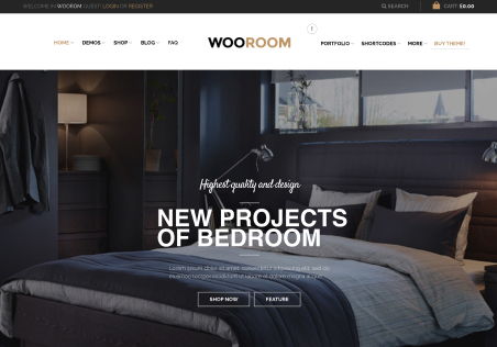
As you can see its not good…the product image is up and on top of the menu.
The name of the product also is on top of the menu, how can i fix this?
I would also like to show related products below the product.
Thanks!
Hello,
If you don’t need effect when the menu is over the image like on our demo https://xstore.8theme.com/demos/interior/product/ajanta-digital-wall-clock-3/ then keep this option disabled http://prntscr.com/olg2zr and reduce the breadcrumbs top padding http://prntscr.com/olg3i6
Regards
Thank you for the reply, it is better but i still would like to have the picture in a kind of boxed way, like this: https://prnt.sc/olgfho
The letters with the product name are also too big : https://prnt.sc/olgh3m
Also i would like to add related products below.
Thanks!
Hello,
Then go to Theme Options > Single product and choose the default layout instead of the product-wide http://prntscr.com/olisy8
Enable related products in Theme Options > Single Product > Related products http://prntscr.com/olitf7
Regards
You must be logged in to reply to this topic.Log in/Sign up