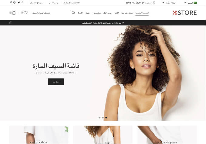
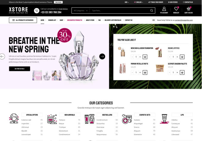
Store on Mobile and Subscribe box - by vapejuicy

This topic has 16 replies, 2 voices, and was last updated 8 years, 4 months ago ago by Olga Barlow

  • Avatar: vapejuicy
    vapejuicy
    Participant
    June 28, 2016 at 11:14

    Hi,

    When I open the shop on mobile – is there anyway to have the product categories visible do the user does not need to use the drop down? – It is likely I will only have 4 categories

    Also every time I try to use the mailchimp form code to create a subscription box the field to enter the email is not centred
    Can you assist 🙂

    Thanks

    Chris

    15 Answers
    Avatar: vapejuicy
    vapejuicy
    Participant
    June 28, 2016 at 11:15

    Also in the header on mobile the wishlist, shopping cart and menu are not evenly spaced – can these be adjusted?

    Avatar: vapejuicy
    vapejuicy
    Participant
    June 28, 2016 at 11:29

    You can see the example of the subscribe box on the home page – its worse on desktop site, the + sign is non-intuitive, basically I want the one like on the footer of the live preview demo but can see it anywhere on the demo pages…. just need somewhere to hook in the mail chimp 🙂

    Avatar: Olga Barlow
    Olga Barlow
    Support staff
    June 28, 2016 at 12:59

    Hello,

    There is no option in our theme to display the list of categories on mobile only. We can only change the order of sidebar and place it first on mobile, before all the products. Then users will see categories list first.

    Added `.sidebar-position-left > .row {
    display: flex;
    flex-wrap: wrap;
    flex-direction: column-reverse;
    }` in custom css.

    I don’t see mailchimp form in footer or on home page, so can’t check the problem to help you.

    I have fixed wishlist and cart on mobile. Check.

    Regards,
    Olga Barlow

    Avatar: vapejuicy
    vapejuicy
    Participant
    June 28, 2016 at 13:50

    Hi Olga, Thanks for the wishlist and categories – on the mobile shop can the categories be displayed centered? also the drop down list is still there – can this be removed.

    Just noticed it has changed the layout on the desktop site – this needs to stay default.

    is there any sample code I can insert for a mailchimp form?

    Avatar: vapejuicy
    vapejuicy
    Participant
    June 28, 2016 at 13:58

    On desktop – There is now a big white gap on the top of the shop page and it is missing the categories 🙂

    Avatar: Olga Barlow
    Olga Barlow
    Support staff
    June 28, 2016 at 14:10

    Hello,

    Oh, sorry, I have added code in global custom instead of mobile. Fixed.

    To remove drop-down go to Appearance > Widgets > remove widgets from Filters area.

    Regards

    Avatar: vapejuicy
    vapejuicy
    Participant
    June 28, 2016 at 14:15

    Hi Olga – looks the same?

    Avatar: vapejuicy
    vapejuicy
    Participant
    June 28, 2016 at 14:26

    if you go to http://www.vapejuicy.com/shop – that’s how the desktop site should look – cheers

    Avatar: Olga Barlow
    Olga Barlow
    Support staff
    June 28, 2016 at 15:49

    Hello,

    Maybe you saved old options and rewrote my changes. Check the backend, custom should look like http://prntscr.com/bm51km

    Also, don’t forget to enable VC for Static blocks http://prntscr.com/bm53m3 It will be easy for you to edit them.

    Add the following code in custom for mailchimp form

    
    .mc4wp-form-fields{
        width: 50%;
        margin: 0 auto;
        position: relative;}
        
    .mc4wp-form input[type="email"]{width:100%;}

    Regards

    Avatar: vapejuicy
    vapejuicy
    Participant
    June 28, 2016 at 15:55

    Hi Olga – Thanks for all your support – its looking better now, some more questions…:-)

    When on the mobile site and you go to shop (or on any page other than the home page) – where is says shop or my account etc. the red background takes up 2/3 of the screen – can this be smaller?

    Cheers

    Avatar: vapejuicy
    vapejuicy
    Participant
    June 28, 2016 at 16:11

    Thanks Olga – it was probably my fault 🙂

    Also on the shop – can the search for box be made square and the ‘search for’ text be removed, there also looks like the gap between the categories red block and search row is too big and looks uneven – can this be changed?

    Avatar: vapejuicy
    vapejuicy
    Participant
    June 28, 2016 at 17:03

    Still cant get a subscription box working… added one in prefooter but it does not show, the one on xstore demo is cool but cant find it – I need a fill width black box with big writing allowing me to subscribe to my mail chimp – is there a way to do this?

    Avatar: Olga Barlow
    Olga Barlow
    Support staff
    June 29, 2016 at 09:27

    Hello,

    At present we have only 2 options for breadcrumbs – small and large (Theme Options > General > Breadcrumbs > Size). In future, we’ll add the ability to change paddings.

    Don’t see the search box that you are talking about. Anyway, there are no such options by default, you can try to implement it by additional customization in case you have appropriate skills.

    Provide me link to the page where you want to add MailChimp form and tell me the place where it should be added. Will it be only form or text and form below? What should be the color of bg?

    Regards

    Avatar: vapejuicy
    vapejuicy
    Participant
    June 29, 2016 at 09:34

    Hi Olga can you put it in the bottom of the home page, with the box in black and the writing in red and white like the theme? if you can make it in visual editor so I can edit the text and move it later?

    Also the shop sidebar – I want to add another widget with top products beneath categories but only on the desktop site not mobile like on your demo pages – is this possible.

    Kind regards

    Chris 🙂

    Avatar: Olga Barlow
    Olga Barlow
    Support staff
    June 29, 2016 at 09:45

    Hello,

    I have provided subscription code in other your topic. Check it, please.

    You may try to hide that widget with css on mobile. For example

    .sidebar-widget.widget_products {
        display: none;
    }

    Regards

  • Viewing 16 results - 1 through 16 (of 16 total)

The issue related to '‘Store on Mobile and Subscribe box’' has been successfully resolved, and the topic is now closed for further responses

8theme customization service
We're using our own and third-party cookies to improve your experience and our website. Keep on browsing to accept our cookie policy.