This topic has 3 replies, 2 voices, and was last updated 3 years, 1 months ago ago by David Henry
Hi Guys,
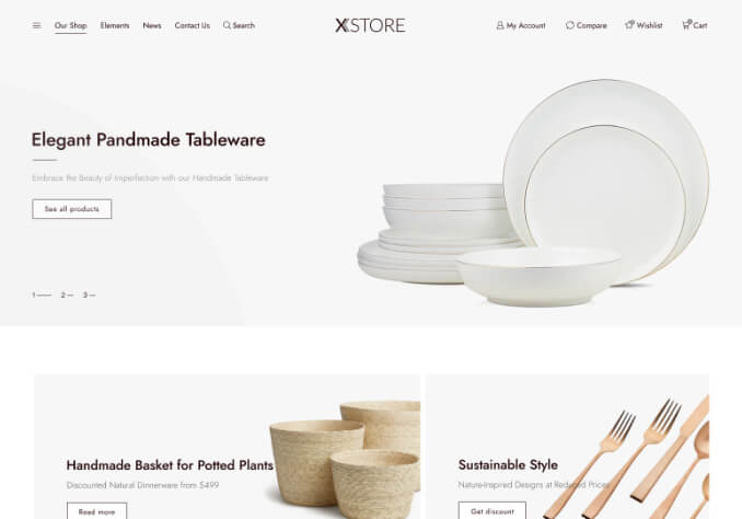
on mobile we used to have one column of products, now it’s two. How do we get it to just one. 3 on Desktop is the only option I see.
Also, my client swears we has an option to “display 12 / 24 / 26 / all” products on mobile. Is there a way to get that back too?
David
Hello,
1/ Add this code in Theme Options > Theme custom CSS > Custom CSS for mobile:
.products-grid .product {
width: 100%;
}
2/ Theme Custom CSS > Mobile:
.products-per-page {
display: block !important;
}
Regards
Thanks Rose.
d
Tagged: life, opportunity, templates, time, value, woocommerce, wordpress
The issue related to '‘Two things we can’t get back, no idea why’' has been successfully resolved, and the topic is now closed for further responses