This topic has 16 replies, 4 voices, and was last updated 3 years, 9 months ago ago by Olga Barlow
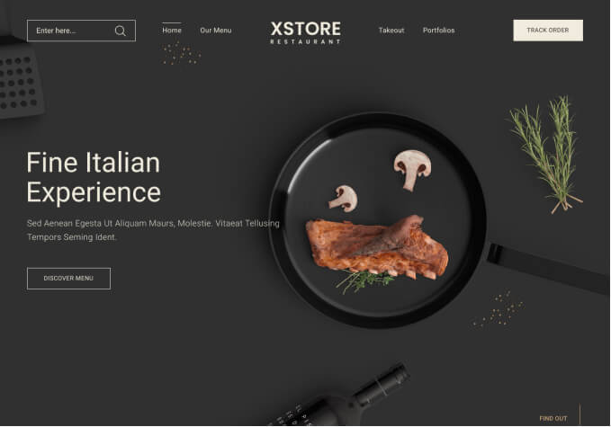
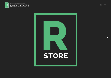
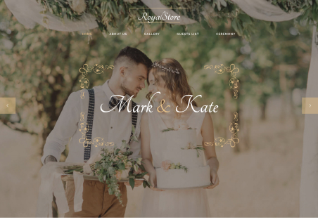
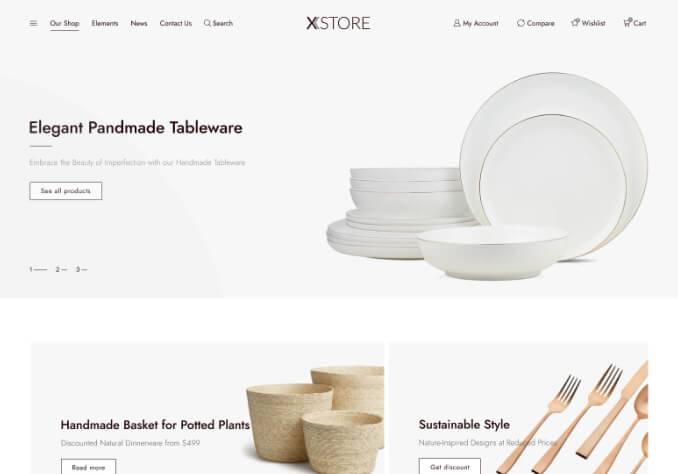
Hi! I am uploading two screenshots on how my “Editor” view shows me the website, and how it actually looks. I do not understand why it is night and day difference, even though I’ve published the changes and it’s not(or does not seem to be) a cache issue
Hello,
What is the screen size of your monitor? Try to change zoom in settings of browser.
Regards
Hi! It is 13.3 inch, with 2560 x 1600. Playing with the zoom fixes it. If I move the zoom to 150% I see it as I want it; if I move the zoom to 50% I can see on Editor as I see it on 100% zoom. How can I unify them? If I change it for one it will change for the other, but I need them to be the same for both.
Hello,
Could you, please, provide us with WP Dashboard access to your site to check the issue in more detail?
Regards
I have added the credentials on the Private content area section
Hi
Dear this is not a theme issue it is just because of your system screen size. We have checked your website on 15.4 inch screen and it is working fine https://prnt.sc/1041gsc , please reduce your browser zoom size to 80% or less it will be accurate or check with reduce the Elementor sidebar dashboard https://prnt.sc/1041io2
Oh ok. Thank you!
Hi
You are always welcome
Hi! I’ve been trying to solve this. But I am not sure how to make it look like it looks on the other view. I can change the zoom for the edit, but I am not sure how to make it look like it does when it’s zoomed in. Nothing changes in either configuration, so I am not sure what should I change
Hello,
I checked your site, tried to change sticky header color, Logo size even without zoom and did not face any issues https://gyazo.com/c0bb50605211b69e2af348bb3b13f890
Regards
I don’t want it to look like that. I want it to look like this:
https://snipboard.io/ZPBMRA.jpg
Which I get when editing. It respects the setting and changes I made in order to look like that.
Hello,
Screenshot you provided is the mobile header that appears for users with screen resolution less than 893px. Do you mean that you want this layout even for the desktop version (greater than 893px)?
Regards
Yes! I am editing it on the Desktop mode. I want it to look at that in all versions. I choose the same option for all modes(Desktop, iPad and mobile).
https://snipboard.io/TOChPA.jpg
Which is why I’m puzzled. I have always made the same configuration across all of those modes. The configuration is how I want it and choose it, but it doesn’t replicate it. It’s not like it changes the configuration of ‘Mobile’ and ‘Desktop’, but they are both the same(like I want it); yet, for the life of me I don’t know why it doesn’t apply to Live Desktop. I cannot modify it, I think, because it’s already set under the configuration as I want it.
Hello,
Check now, please.
Regards
Oh, yes. It looks how I wanted it to. Thank you. What was missing?
Hello,
I just used the same elements for the desktop header as you used for the mobile header https://gyazo.com/0f3ffcaf04cb61b889a3187546808c4a
Regards
You must be logged in to reply to this topic.Log in/Sign up