This topic has 4 replies, 3 voices, and was last updated 3 years, 1 months ago ago by Rose Tyler
Hi,
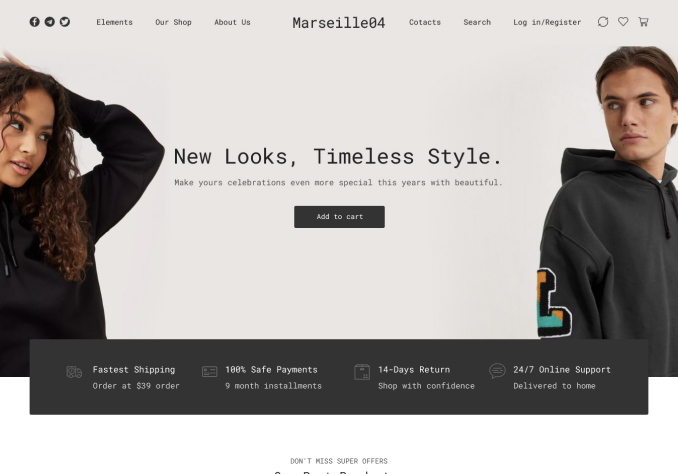
I am running my site through different screen size emulator sites and the 2 consistent wrong sizes for desktop are:
10″ Netbook
1024 x 600
12″ Netbook
1024 x 768
This is where i am testing it:
https://bluetree.ai/screenfly/
anything desktop above 1280px is fine.
Can you help with the above please?
See this video:
Hello,
Sorry but I’m not sure that understand your question. Do you want to show the menu in one line for that resolution? In this case you need to use custom code and reduce the font-size for example
@media only screen and (max-width: 1155px){
.header-main-menu2.et_element-top-level .menu > li > a, .header-main-menu.et_element-top-level .menu > li > a {
font-size: 14px;
}
}
Regards
Thank you!
You’re welcome!
Regards
Tagged: desktop, optimization, responsive, screen sizes, themes, woocommerce, wordpress
You must be logged in to reply to this topic.Log in/Sign up