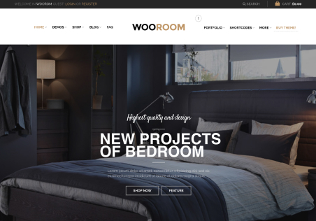
When product options selected the sections below overlap the right column

This topic has 6 replies, 2 voices, and was last updated 1 years, 2 months ago ago by Rose Tyler

  • Avatar: Fantasy Prints
    Fantasy Prints
    Participant
    September 13, 2023 at 15:03

    Hi There

    Setting up new website using your excellent theme. I have setup a sticky RIGHT column for products this works great and scrolls great BUT when I select options for a product then an overlap happens. Seeing ways to solve.

    Also different question is there way to remove the PRODUCT IMAGE from the gallery below the PRODUCT IMAGE. As its a different shape to the others it causes the gallery not to look right.

    Please, contact administrator
    for this information.
    5 Answers
    Avatar: Rose Tyler
    Rose Tyler
    Support staff
    September 15, 2023 at 09:41

    Hello, Fantasy Prints,

    Thank you for getting in touch with us.

    1/ Could you please record a video of the problem? What browser do you use?
    Upload the video on a filesharing service, for example – https://wetransfer.com/ , and provide us with the URL.

    2/ There is no such option, unfortunately. You may contact support of WooCommerce, maybe they will be able to advise some workaround – https://wordpress.org/support/plugin/woocommerce/

    Kind Regards,
    8theme team

    Avatar: Fantasy Prints
    Fantasy Prints
    Participant
    September 18, 2023 at 11:57

    Thanks below link to two videos. One shows the website working correctly and the other video shows once you select a product option the bottom below the cart overlaps the RELATED PRODUCTS and FOOTER

    https://we.tl/t-16WtVA6ePX

    Avatar: Rose Tyler
    Rose Tyler
    Support staff
    September 18, 2023 at 14:51

    Hello, Fantasy Prints,

    Thank you for your response.

    We should tell you that all our tries to fix it in a good way were skipped because no one got success in the end of a good result. But we thought about solving this issue from another side because according to your needs as we got you right you want to keep your gallery always in the area of customers so we decided to propose the next solution:
    – disable the sticky option. Or
    – the next custom CSS code:

    @media only screen and (min-width: 993px) {
        .element-TFML4.et_column {
            max-height: 80vh;
            overflow: auto;
        }
    }

    Kind Regards,
    8theme team

    Avatar: Fantasy Prints
    Fantasy Prints
    Participant
    September 18, 2023 at 15:46

    Thanks for looking into it. I will leave design at moment as still like the sticky design but may switch off.

    Avatar: Rose Tyler
    Rose Tyler
    Support staff
    September 18, 2023 at 16:13

    Hello, Fantasy Prints,

    If you have any other questions or concerns, please do not hesitate to reach out to us. Our support team is always available to assist you.

    Kind Regards,
    8theme team

  • Viewing 6 results - 1 through 6 (of 6 total)

You must be logged in to reply to this topic.Log in/Sign up

8theme customization service
We're using our own and third-party cookies to improve your experience and our website. Keep on browsing to accept our cookie policy.