This topic has 5 replies, 4 voices, and was last updated 9 years, 7 months ago ago by Eva Kemp
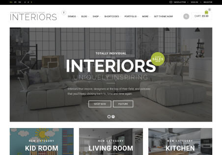
Hi! I love this theme! Is there any way to decrease the whitespace under the logo on the home page? I’d like the logo to sit right on top of the menu bar if possible. As well, is there a way to make the search box and the shopping cart link lower down on the page to be right above the menu bar (aligned to the bottom of the logo), rather than having it be aligned to the top of the logo? Thank you!
Hello
Please provide us with the link to your site.
With best regards
Brian Johnson
Hello,
Please try to add the following code in custom.css file.
.logo{
margin-bottom: 0px;
height: 160px;
}
#main-nav{
margin-top: 0px !important;
}
#search{
margin-bottom: 0px !important;
margin-top: 132px !important;
}
#top-cart{
margin-top: 115px;
}
Here is a video tutorial how to create custom.css: https://www.youtube.com/watch?v=Qok2zRedRMY&feature=youtu.be.
Regards,
Robert Hall.
Thank you! This worked perfectly!!! 🙂
Hello,
You’re welcome.
Regards,
Eva Kemp.
Tagged: design, layout, logo, themes, whitespace, woocommerce, wordpress
The issue related to '‘Whitespace Under Logo’' has been successfully resolved, and the topic is now closed for further responses