This topic has 4 replies, 2 voices, and was last updated 10 years, 5 months ago ago by Eva Kemp
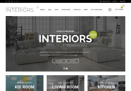
Can you help with the best image dimensions to make the logo bigger or the .logo area allowed to be wider?
It seems the div.logo is smaller than the div.cart-summ area.
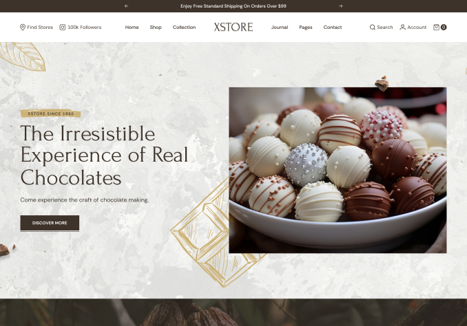
I want the subdomain site logo to look more like the main site logo. Info below
Thanks!
Mike
Hello,
Please add this code into custom.css file of your subdomain:
.header5 .logo img, .header6 .logo img, .header1 .logo img, .header7 .logo img {
max-width: 450px; }
.header5 .logo, .header6 .logo, .header1 .logo, .header7 .logo {
float: right;
}
Regards,
Eva Kemp.
Fantastic! Thank you Eva! That works well for the different size logos.
One issue that I’d like to resolve is how the logos look on the fixed navigation menu. They are too small because, I think, the logos are very wide.
Is there a way to specify a different logo, or better configuration for the appearance on the fixed navigation menu?
Thanks so much! Mike
Please use this code for the fixed header of the site realkitchenchicago.com:
.fixed-header-area .fixed-header .logo-with-menu {width: 300px;}
and this one for montrose.realkitchenchicago.com:
.fixed-header-area .fixed-header .logo-with-menu {width: 350px;}
Regards,
Eva Kemp.
You must be logged in to reply to this topic.Log in/Sign up