This topic has 30 replies, 2 voices, and was last updated 10 years ago ago by Eva Kemp
Hi Eva,
Could you please guide me on how to create these on my website? I got the following pictures below from 8th theme demo website:
https://www.8theme.com/demo/royal/?page_id=22696&et_styles=0-11-1-3-0-1
Request 1:
http://i1340.photobucket.com/albums/o728/LibardoBarreto/JUNK/C_zps1606a51b.png
Request 2:
How Do I change the header white color to ” Black “? And also add the images next to the fisherman? (All pointed in “Red Arrow”)
http://i1340.photobucket.com/albums/o728/LibardoBarreto/JUNK/A_zps1c9e4474.png
When I imported the theme it shows like this:
http://i1340.photobucket.com/albums/o728/LibardoBarreto/JUNK/B_zps0e8cbf28.png
You can see it on (www.bkbcuracao.com/comingsoon)
Hello,
Seems not all content was imported for you. This may be caused by your server configuration.
Please check what php version is used on a server at your hosting provider. It shouldn’t be less than 5.3 version. Also ask them to increase upload_max_filesize, post_max_size and memory_limit functions.
Please provide us with wp-admin panel credentials to give you the correct code for menu background color.
Thank you.
Regards,
Eva Kemp.
Hi Eva,
Please see in private.
Hello,
Have you checked the required information at your host?
Thank you.
Regards,
Eva Kemp.
Hi Eva,
The Version is :(see private)
Hello,
There are no permissions for the user you created to view all settings.
Please provide us with full access.
Have you provided the information of your local server? Can you ask the info at your host?
Thank you.
Regards,
Eva Kemp.
Hi Eva,
Please check me in private.
Hello,
I’ve added the following code into custom.css file to change background color of the fixed header:
.menu > li > a, .shop-text, .cart-summ:focus, .cart-summ {
    color: #FFF !important;
}

.fixed-header-area {
    background-color: black !important;
}
Please check it now.
Please specify: do you want to use Fishing template or just add images just the same way as shown on the demo?
Thank you.
Regards,
Eva Kemp.
Hi Eva,
Yes the header menu looks good. For the (Please specify: do you want to use Fishing template or just add images just the same way as shown on the demo?) I would like to have a Slider Photo Gallery in which when the customer clicks on the photo it become a bigger size in the same window.
Thanks..
Hello,
In this case you can use Image Gallery element in Visual Composer editor and select the settings you need.
Thank you.
Regards,
Eva Kemp.
Hi Eva,
What code to user or how to add the transparent image like this on my page?
http://i1340.photobucket.com/albums/o728/LibardoBarreto/JUNK/gfdgdfg_zpsa6bc545d.png
Hi Eva,
How do I centralized the text like it illustrate in the image below?
http://i1340.photobucket.com/albums/o728/LibardoBarreto/JUNK/jgh_zpsfa165f6d.png
Also can you guide me on how to use the Woocommerce option? I have added the products as instructed before but is not showing as should (See Below)
http://i1340.photobucket.com/albums/o728/LibardoBarreto/JUNK/hfghfgh_zps68458a08.png
>> Also how to define what to let be viewed on each page that have the option of products? For instance in this case when I open my homepage and scroll all the way down I see the partners logos and now also the other products. I want only the logos to show how to define this per page or category? Is it possible for you to create this and I will copy and past it for the rest?
What I also wants is to have the text replace as the one below:
>> This way is correct
http://i1340.photobucket.com/albums/o728/LibardoBarreto/JUNK/txt_zps0a8c93cd.png
>> Not correct (Existing)
http://i1340.photobucket.com/albums/o728/LibardoBarreto/JUNK/ffgdfg_zps60c2f31c.png
Is it possible for you to create this and I will copy and past it for the rest?
Hello,
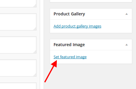
Concerning your products where images aren’t shown, the problem is you didn’t set featured products them. Go to Product > select a product you need to edit and set a featured image at the bottom on the right side:

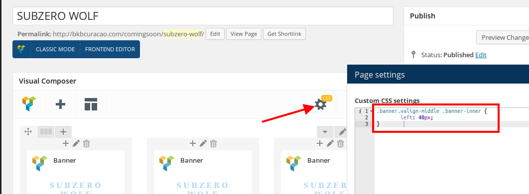
To fix the banners text alignment I’ve added the following code into CSS editor on the page “SUBZERO WOLF”

You can install Interiors template and check how layers are added in the slider.
As I see on your home page only Partners logos are displayed and there are no products.
Could you please specify on which page you see the transparent image?
Thank you.
Regards,
Eva Kemp.
Hi Eva,
The transparent image I found it on the demo Retro Pub Royal
https://www.8theme.com/demo/royal/?page_id=23071&et_styles=0-1-3-8-0-7
Hello,
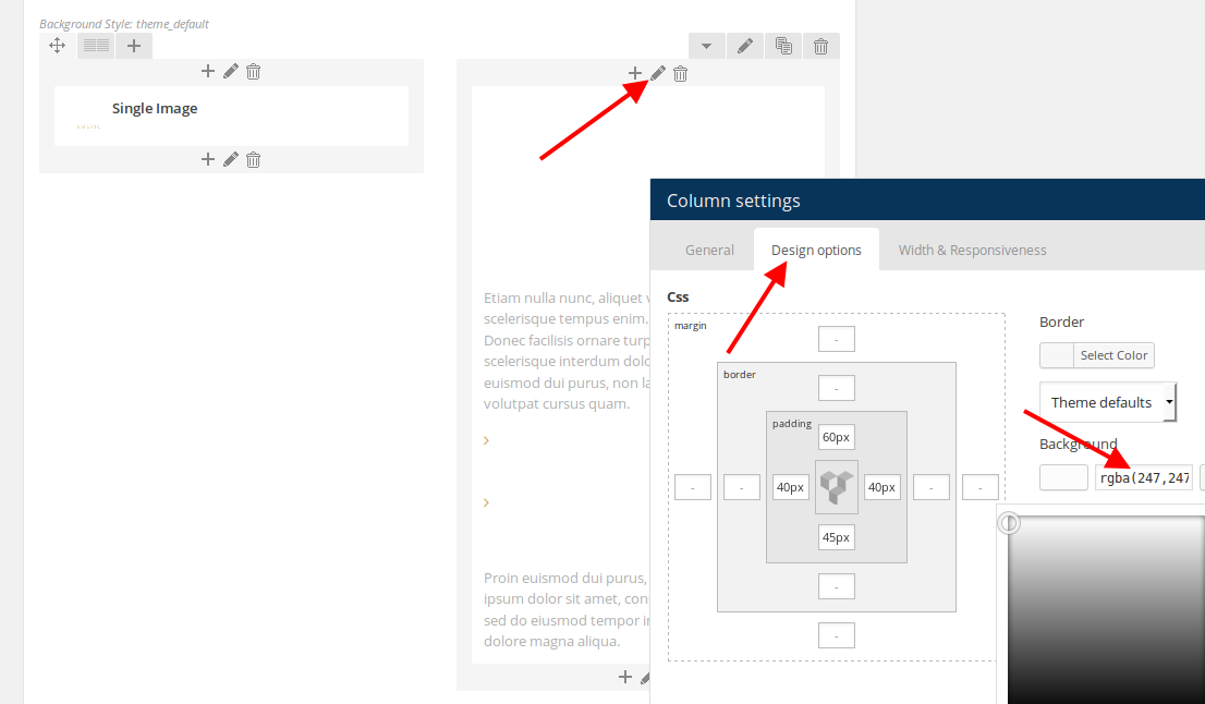
Text element of Visual Composer editor is used there and the background color for that column set is rgba(247,247,247,0.3).
Thank you.
Regards,
Eva Kemp.
Hi Eva,
Thanks..
Is there a way to add the gallery as the one of the Fishing Demo Template instead of Image Gallery? The image gallery will crop all the pictures next to each other and there is no space between and nice look and feel as the one of the fishing demo template:
http://i1340.photobucket.com/albums/o728/LibardoBarreto/JUNK/gg_zps0acdd3ef.png
If that is the way the Image Gallery works is there another alternative which can facilitate to have a nice look and feel for the images?
Hi Eva,
Can you guide me step by step where to insert these criteria s?
>> Text element of Visual Composer editor is used there and the background color for that column set is rgba(247,247,247,0.3). <<
Or any print screenshot?
Thanks alot
Hi Eva,
Ok I have manage to insert the Feature Image. Now I have a question how to link each product to a specific partner. For example ” Kohler , Subzero Wolf etc… “.
=======================================
Hello,
Concerning your products where images aren’t shown, the problem is you didn’t set featured products them. Go to Product > select a product you need to edit and set a featured image at the bottom on the right side:
Hello,
On your screenshot Posts Slider element of Visual Composer is used.
To add the value for background color in Text element you need edit the column where it’s added:

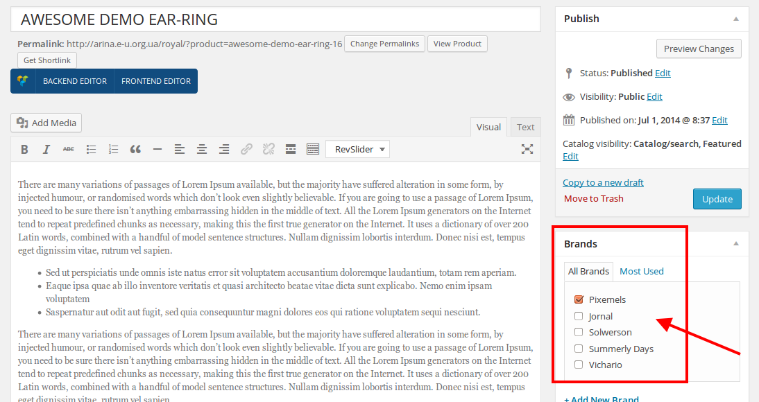
To mark a product with a brand go to Products > select a product to edit and you’ll see brands that you created in Products > Brands:

Thank you.
Regards,
Eva Kemp.
Hi Eva,
Seems like it not going. Ok what I want to have is that on Kohler Page it shows Kohler Products. If you see in the printscreen below the ” Fridge ” is showing on the Kohler page. How do I make a distinguish to this?
http://i1340.photobucket.com/albums/o728/LibardoBarreto/JUNK/frrr_zpsa90a4f04.png
http://i1340.photobucket.com/albums/o728/LibardoBarreto/JUNK/4tt_zps145fc3a5.png
Also how do I filter which products comes first and last? For instance if I want the fridge first and a oven at last in the product slider :
http://i1340.photobucket.com/albums/o728/LibardoBarreto/JUNK/frrr_zpsa90a4f04.png
Hello,
You can write products IDs in the Products element settings to select what products to show.

To find a product ID, go to Products, hover a product title and you’ll see ID number:

Unfortunately there is no possibility to order the products in a slider.
Thank you.
Regards,
Eva Kemp.
Hi Eva,
I think we miss this one, (I know you mentioned to use the image gallery, but is there any other way?)
Is there a way to add the gallery as the one of the Fishing Demo Template instead of Image Gallery? The image gallery will crop all the pictures next to each other and there is no space between and nice look and feel as the one of the fishing demo template:
http://i1340.photobucket.com/albums/o728/LibardoBarreto/JUNK/gg_zps0acdd3ef.png
The images looks close and does not have a stylish look in which the post image of the fishing demo does. I know its not the same. But from experience is there another way to have a similar look and feel? Maybe you ca guide via screen shots and I will proceed with thr steps.
>> Or maybe we can use the same demo images as the fishing demo content and just do a hyperlink to a bigger image when you press on the image?
Thanks.
Hello,
I’ve added the code to increase padding between images in the image gallery.

Please check if it’s fine now.
Thank you.
Regards,
Eva Kemp.
Hi Eva,
Thanks. The space between the images looks perfect!
However is there any other way also when I hover the mouse over the image it will looks like this :
http://i1340.photobucket.com/albums/o728/LibardoBarreto/JUNK/gg_zps0acdd3ef.png
Another point on top of this post is the product IDs… I added the product id as suggested but now I see only one product and the rest is not showing. How to let the rest also be visible? Do I need to add anything in the middle of each ID? Like a , . / – = ?
http://i1340.photobucket.com/albums/o728/LibardoBarreto/JUNK/id_zps58479316.png
http://i1340.photobucket.com/albums/o728/LibardoBarreto/JUNK/pp_zps421d4307.png
Also some products I see that they have a round circle at the top stating ” SALE “. How to add a round circle stating ” NEW “? In addition is there a way to change the color of these circles?
Hello,
You need separate IDs with comma.
To mark products as New you can refer to this article: http://support.8theme.com/index.php?/Knowledgebase/Article/View/9/0/how-to-mark-products-as-featured-and-new-ones
Those icons are images and you can change their colors only with some image editor.
You can achieve the same style for your gallery only if you use Posts Slider element, select Post type and be sure your blog posts have featured images.
Thank you.
Regards,
Eva Kemp.
Good Day Eva,
How can I remove the More Details and leave the option only to view the image as large?
http://i1340.photobucket.com/albums/o728/LibardoBarreto/JUNK/dfsdf_zps0e800b12.png
Also is there a way to change the color when hover the mouse over the image?
Hello,
You can change hover color with this code in custom.css file:
.teaser_grid_container .post-thumb .zoom >i {
background-color: red !important;
}
Unfortunately 2 buttons can be removed. Do you agree with it?
Thank you.
Regards,
Eva Kemp.
Thanks Eva.
Is there a way also to use the Hex colors like this code >> 0026FF which represents a blue color? If yes how do I adapt it in this code:
.teaser_grid_container .post-thumb .zoom >i {
background-color: red !important;
}
=====================================================================
With regards to the button I just would not like to have the ” More Details ” option available when hover your mouse on the image. I want the customers to have the option to ” View Large “. Would this be possible?
http://i1340.photobucket.com/albums/o728/LibardoBarreto/JUNK/dfsdf_zps0e800b12.png
Is there also anyway to choose these arrows to be visible instead of what I currently have online?
Arrows:
http://i1340.photobucket.com/albums/o728/LibardoBarreto/JUNK/aaaa_zpsa83156b0.png
What I have online:
http://i1340.photobucket.com/albums/o728/LibardoBarreto/JUNK/ghfgh_zpsb8824c6a.png
To be clear I would like for the arrows to be visible instead of the numbers.
Hello,
You can use this code:
.teaser_grid_container .post-thumb .zoom >i {
background-color: #0026FF !important;
}
You can remove “More details” button only in the file wp-content/themes/royal/framework/theme-functions.php (line 2300), delete the code <a href="'.get_permalink($post_id).'"><span>More details</span></a>, but it will be removed from all sections where you’re using this element. Unfortunately in css 2 buttons can be removed.
To have arrows displayed you need use Posts Slider element instead of Posts Grid.
Regards,
Eva Kemp.
The issue related to '‘Woocommerce and Image’' has been successfully resolved, and the topic is now closed for further responses
