Hello,
Your Xstore demo Finances that comes with clean install does not exactly match your online demo.
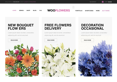
Please advise how can I achieve the effect that you have on the demo home page of Xstore>Finances – three horizontal callout blocks immediately under main Revolution Slider. In your demo, top of the the blocks slightly overlaps over the bottom part of the Revolution Slider, headline is in bold font and all three blocks have a shadow on the bottom.
However, after clean install of your Finances demo on my server, the headline is not in bold font, none of the top sections of those three blocks overlaps over the bottom part of the Revolution Slider, and there is no shadow on the bottom. There is no option to edit these features via WP Bakery. A custom CSS for that section of your official demo, that was not updated in the distribution file, maybe…?
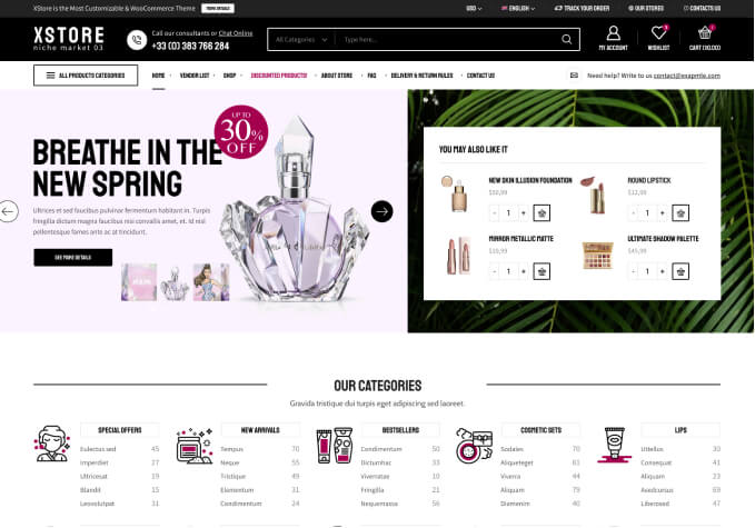
See attached screenshots of your demo and my clean install of the same demo.
Thanks for your help.


